Behind the Seams: Wildflowers

The Wildflower Collection Design Process
As the world stood still in 2020 and halted all possible OK campaign ideas for Women’s Month and International Women’s Day, we knew that we had to go back and challenge some of the ideas we had in mind in order for it to resonate with what everyone was going through. And as the long break went on, it actually presented us with a much stronger concept.
It was tough going through the effects of the lockdown ourselves — but reading and listening to stories of what a lot of women had and continue to go through as mothers, health care workers, teachers, business owners, and so much more, was what struck a chord with us. Hearing all these stories and shared experiences truly brought to light the strength of women across the globe.
For this collection, we focused on the tenacity and determination that many of these women have shown throughout the pandemic. Just like wildflowers, they’ve flourished no matter where they’re planted.

PATTERN
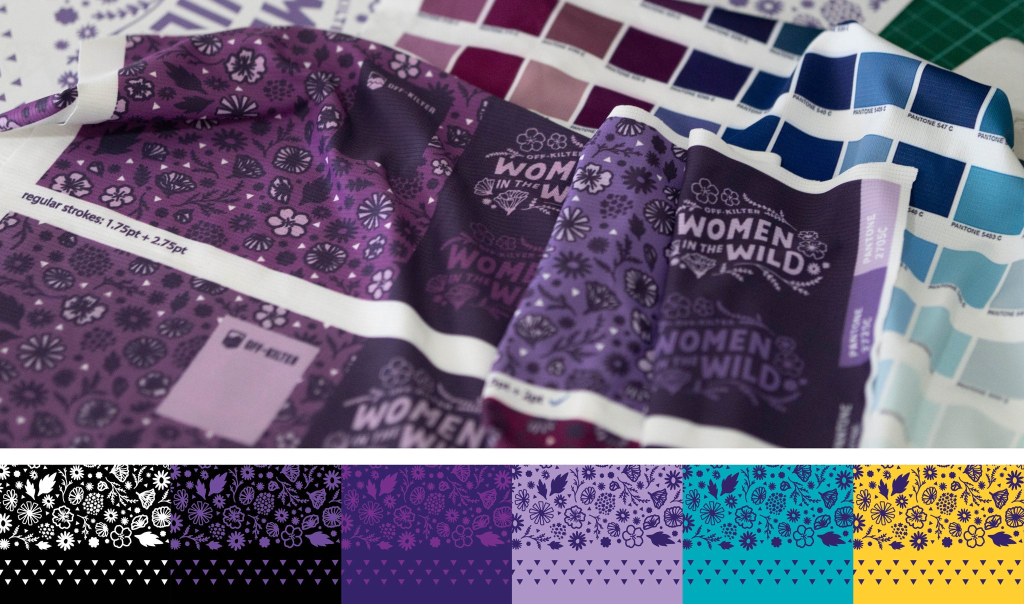
In designing the jersey, we had several initial ideas in terms of how to execute the floral pattern. There were design directions like big bold playful shapes, bouquet arrangements placed randomly, cartoony and exaggerated details, to botanical illustrations. We then got to work by gathering photo references of various wildflowers, taking a look at seamless and not-so-seamless pattern compositions, sketching out the flora, and iterating before settling in on the final one. (Of course we couldn’t resist throwing in some California poppies in there!)
The final design we ended up with was simple floral illustrations in varying line weights that didn’t focus on any one specific wildflower species. It resulted in scattered flowers that could either be interpreted as a field of wildflowers or a bunch of flowers being carried off into the wind. Ultimately, it turned out to be something subtle that needed to be seen up close to be understood. Understated with a hint of playfulness was what we were going for.

TYPOGRAPHY
The typography, on the other hand, took more time to develop than we had hoped. The initial idea was to create a statement or a set of words that could be used as a badge on the arm that helped reinforce the concept. We played around with several ideas like “Wild Women” or “Wild on two Wheels” but the words didn’t feel quite right. In the end, we settled on “Women in the Wild” as a subtle reference to the relationship/comparison of wildflowers to women. We liked the idea of what “wild” could convey in terms of environment — home office, messy house, busy hospital floor, etc.

We then took the same overall style to create a new lockup for the Off-Kilter mantra: “Ride any way you want. Just Ride.” which we added to the bandana design to tie in some branding elements to it.

COLOR
For this release, we were contemplating on using other colors but ended up landing back on purple. We decided to continue working with it since this hue has been recognized as one of the colors that symbolize feminism and International Women’s Day. After some color explorations, tests, and printed swatches, we landed on the right ones and extended it to the single-ink bandana print.

The bandana was a fun accessory we thought could compliment the jersey and be used outside of riding. A lot of cyclists we know use neck gaiters, which in our experience, can be stuffy and hot around the neck because of our tropical weather. We thought that a printed bandana could be an alternative that wasn’t as constricting, looked stylish — and for people like us who love to ride without any set plans, it ends up becoming something handy if we had to wipe stuff down, wrap things, or even fasten stuff to the bike.
Lastly, we tossed in triangle motifs, similar to the triangle pattern in our 2019 campaign, to represent the yoni, or divine feminine energy. White triangles were scattered in the overall pattern and were also used as a border around the bandana to help frame it — an element, we felt, that helped lighten up the design.

All in all, the collection turned out to be liked not only for its subtleties, but for the fit as well. We had recently moved from our old supplier, due to QC and creative control issues, and really pushed and worked with our new factory partners in Singapore to dial in the fit of our jersey. We’re very proud to have this as a starting point for our relaunch of sorts, and we can’t wait to show everyone what we've been working on and developing the past year and a half. As they would say, baby steps. There are still a lot of things to work on and wish for, but for now we’re just hoping that the design will inspire people to ride and be proud to be the wildflowers that they are.


